
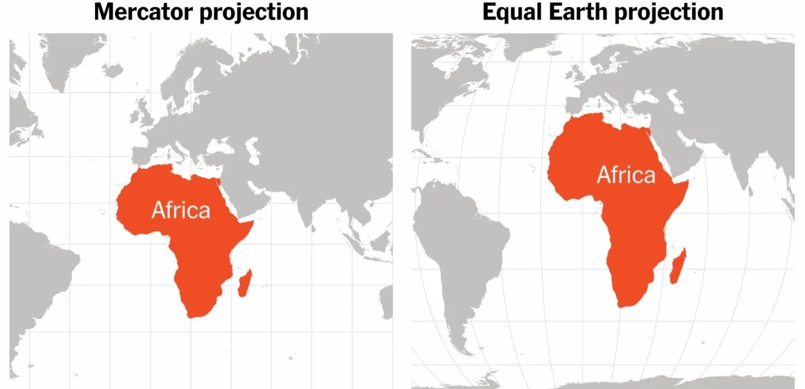
The United Nations has backed a move to encourage the world to use maps that show continents more accurately, especially the size of Africa.
What happened?
On Friday, September 4, 2026, the UN General Assembly overwhelmingly approved the “Correct the Map” resolution.
The resolution passed by 164 votes to one, with the United States being the only country to vote against it. Six countries — Estonia, Georgia, Lithuania, Moldova, Serbia and Ukraine — abstained.
The resolution is not legally binding, but it encourages governments, schools, international organisations and technology companies to consider using more accurate world maps.
Why is the Mercator map being criticised?
The Mercator projection was created by Flemish cartographer Gerardus Mercator in 1569.
It was designed mainly to help sailors navigate. On the map, lines representing a constant direction appear straight, making it easier for sailors to plot routes across the oceans.
The problem is that this comes at the expense of accurately showing the size of countries and continents.
Land areas closer to the North and South Poles appear much larger than they really are, while areas around the equator appear relatively smaller.
What about Africa?
One of the clearest examples is Africa and Greenland.
On a Mercator map, Greenland can appear almost comparable in size to Africa. In reality, Africa is about 14 times larger than Greenland.
Critics say this distortion can influence how people understand the relative importance and scale of different parts of the world, particularly Africa and other regions of the Global South.
What map could replace it?
The UN resolution encourages the use of the Equal Earth projection or other maps designed to preserve the correct relative sizes of land areas.
Unlike Mercator, Equal Earth shows continents in proportions much closer to their actual size.
Is the Mercator map being banned?
No.
The resolution does not call for the Mercator projection to disappear completely.
It remains useful for maritime and aerial navigation because of the way it represents directions.
The main argument is that it should not necessarily be the default map used to teach people what the world looks like.
story by: Mitchell Asare Amoamah
Related Posts